Surfaces Project - Summer Tasks
Use the attached document for a printable version.
In preparation for the start of your A Level Photography course in September the following tasks (to complete over the summer holidays) have been selected to allow you to understand how to; Document, Record, Research, Experiment and Analyse within the field of Photography.
In preparation for the start of your A Level Photography course in September the following tasks (to complete over the summer holidays) have been selected to allow you to understand how to; Document, Record, Research, Experiment and Analyse within the field of Photography.
Task 1 - Equipment
Purchase the following:
1. A3 Black Paper Sketchpad
This will be used as your creative diary. A successful book will record: thought processes; technical and formal experimentation; research and responses to photographers, artists, texts and other sources; and evaluations of resolved pieces, clearly relating the work of other artists/photographers and designers to your own art work.
Daler Rowney & The Pink Pig are good examples of sketchbook brands.
Click below to purchase:
A3 Black Paper Sketchbook - 25 leaves / 50 pages
A3 Black Paper Sketchbook - 35 leaves / 70 pages
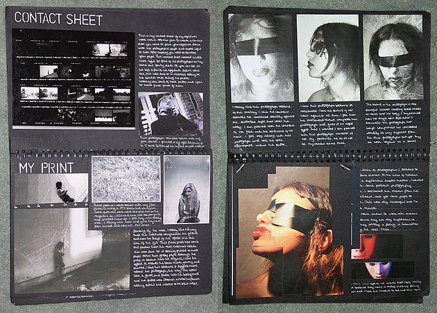
Black Sketchbook Presentation Example
2. Storage Devices
It is vital that you back up all your photographic work on multiple devices in the event of loss, theft or file corruption. Devices can include your computer at home, Weebly website and the options below. The SD card and reader is one of the best options (you can use this in your DSLR camera and is less likely to corrupt like a memory stick).
Recommended
SD Card (minimum 8GB)
SD Reader
Optional Extras
External Hard Drive
Memory Stick
3. Camera Equipment - Optional
Depending on class numbers and equipment availability within school there may be times where you have to share a DSLR camera with another student. You may decide to buy your own photography equipment (or you already own some). This will give you greater freedom to develop your photographic skills and ideas in the evenings, weekends and holiday breaks.
Go to the LINKS section of this website for a more detailed list of suggested starting equipment.
Task 2 - Create a PINTEREST board
Create a Pinterest board entitled Unit 1 - Surfaces.
Pin images/artists/ideas that could potentially LINK to the theme of Surfaces.
Use the following SUB-THEMES to help refine your search:
Reflective Surfaces
Broken Surfaces
Decaying Surfaces
Patterned Surfaces
Macro (Close-Up) Surfaces
Textured Surfaces
Contrasting Surfaces
Beneath the Surface
The following LINK shows you my example.
Task 3 - Front Cover & Mind Map
1. On the cover page of your A3 black sketchbook, create a clear Title entitled SURFACES.
2. On a full page (first page) within your black A3 sketchbook, create a mind map with all the ideas you can think of linked to the theme Surfaces. Remember, you can use the sub-themes to expand your ideas along potentially different paths, or create your own additional sub-themes.
2. On a full page (first page) within your black A3 sketchbook, create a mind map with all the ideas you can think of linked to the theme Surfaces. Remember, you can use the sub-themes to expand your ideas along potentially different paths, or create your own additional sub-themes.
Task 4 - Choosing a Sub-Theme
Select ONE of the following sub-themes:
Reflective, Broken, Decaying, Patterned, Macro (Close-Up), Textured, Contrasting, Beneath the Surface.
1. Initial Photographic Recording
Capture a series of images (10-30) related to your chosen sub-theme using a camera of your choice. You can also use an iPhone or other device (using the Hipstamatic app).
Below is an example of images I have taken for Textured Surfaces in my Art classroom using an iPhone 5 and the Hipstamatic App.
|

|


|

|
2. Image Analysis
Reflect on the images you have captured. Use the following questions to help with your written analysis.
Which sub-theme did you choose to initially record? Why?
How did you go about recording this sub-theme of Surfaces? Did you have a plan? Specific places, ways to shoot or compose your images?
Did any patterns or themes start to emerge whilst shooting?
What what successful about your initial images? Explain your most successful image(s).
What was unsuccessful about your initial images?
How could you develop your work further?
I have analysed the images I captured above in the following section (answering the questions above):
I chose to focus initially on Textured Surfaces due to the fact that my art classroom provided a clear breadth and variety. Using my iPhone 5 I selected the Hipstamatic app. I chose to use OG Film which creates a cropped circular image as I wanted to focus on the positive space of the texture, reducing the amount of negative space within the circular frame as much as possible. I therefore planned to place my camera at an almost macro distance from the desired surface. The use of a circular frame also added an unusual and unexpected element to the areas that would be cropped out of the image. Alongside this I used the Madalena lens which adds a warmth to the overall image. Confining my first series of images to my art classroom forced me to find and create striking compositions within a small, potentially 'limiting' setting. Whilst reviewing the images I had started to capture I noticed a few themes emerging. For example, I was drawn to wooden textures, man-made patterns and abstract shapes left by splattered paint.
My most successful photographs:
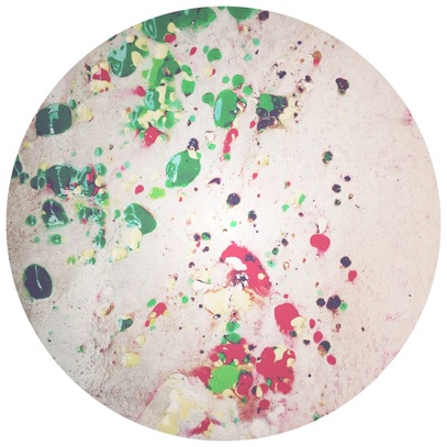
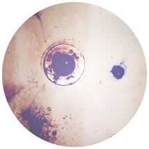
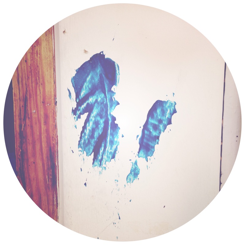
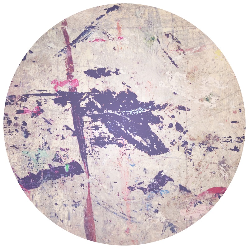
What initially drew me to this composition was the contrast between green and red. By using the circular crop (OG film) method the viewer is now confronted with a series of questions, where was this image taken? What surface are the splatters of colour on? It creates a sense of ambiguity intriguing the viewer. An unexpected element that was captured within the image was the glistening of reflected light across certain areas of the paint adding a sense of depth and form to the surface quality. There is also a range of tonal values, for example vibrant lime greens moving towards a dark Viridian.
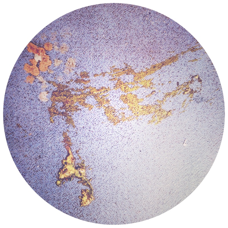
Looking beyond the surface of this image (excuse the pun) one feels a sense of disorder forming, or randomness to the splatters. It reminds me in part of Jackson Pollock's Action Paintings whereby paint is spontaneously splattered, dribbled, splashed and smeared onto a surface rather than being carefully applied.
This image has raised a very important question about future images I capture. Do I photograph 'found' surfaces or do I create the surfaces myself, documenting them using the medium of photography?
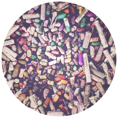
This image successfully captures one of my initial aims. To fill the circular frame completely with positive space. Whilst it could be argued that the black shadows found in between some of the oil pastels provide said negative space it is not the primary focus of the image. However, these pits of blackness do contrast strongly with the variety of pastel colours. The cropped edges splice into cylindrical structures of oil pastel. These act as lead in lines towards the chaotic centre where shorter, crumbling and heavily used pastels are found.
This could be developed into a series exploring equipment and materials found within different departments, subjects.
A correlation can be seen between this image and Jim Goldin and Ursus Wehrli's object series.
This could be developed into a series exploring equipment and materials found within different departments, subjects.
A correlation can be seen between this image and Jim Goldin and Ursus Wehrli's object series.
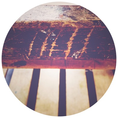
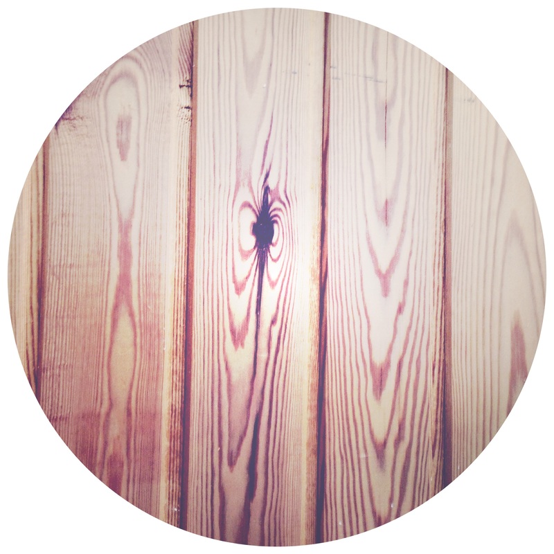
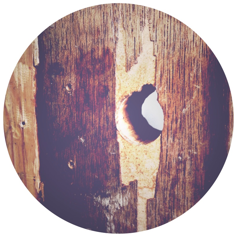
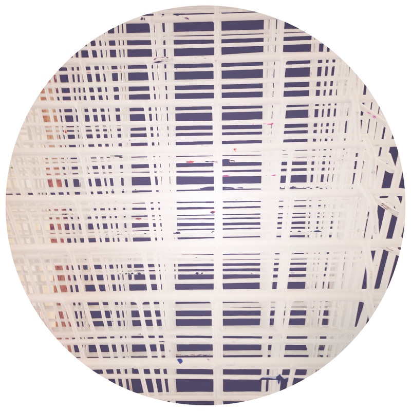
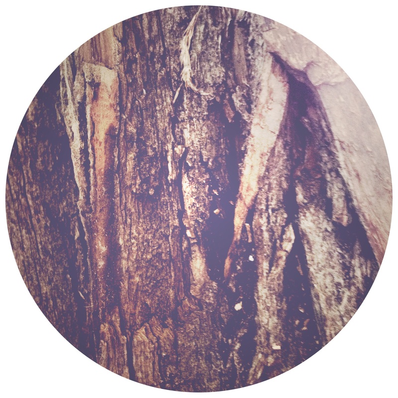
Compositionally I believe this image is a success. The viewer is instantly drawn to the horizontal and vertical lines of the wood alonside the slightly diagonal carvings. The vertical lines lead the viewers' eyes up towards the main focus of the image, the five carved marks into the surface of the wood. The light wood that is revealed is in stark constrast to the dark brown/black. Why were these marks created, by whom?
This image has inspired me to capture future surfaces with strong linear elements. I could explore alternative framing methods. Possibly using a panorama or images fragmented into vertical strips. Adding a duality of surfaces, the surface found within the image and the surface of the printed image once displayed and installed in a space.
This image has inspired me to capture future surfaces with strong linear elements. I could explore alternative framing methods. Possibly using a panorama or images fragmented into vertical strips. Adding a duality of surfaces, the surface found within the image and the surface of the printed image once displayed and installed in a space.

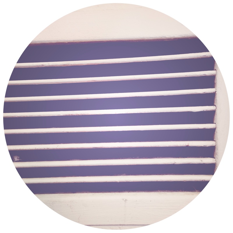
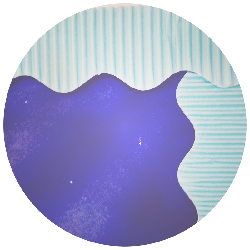
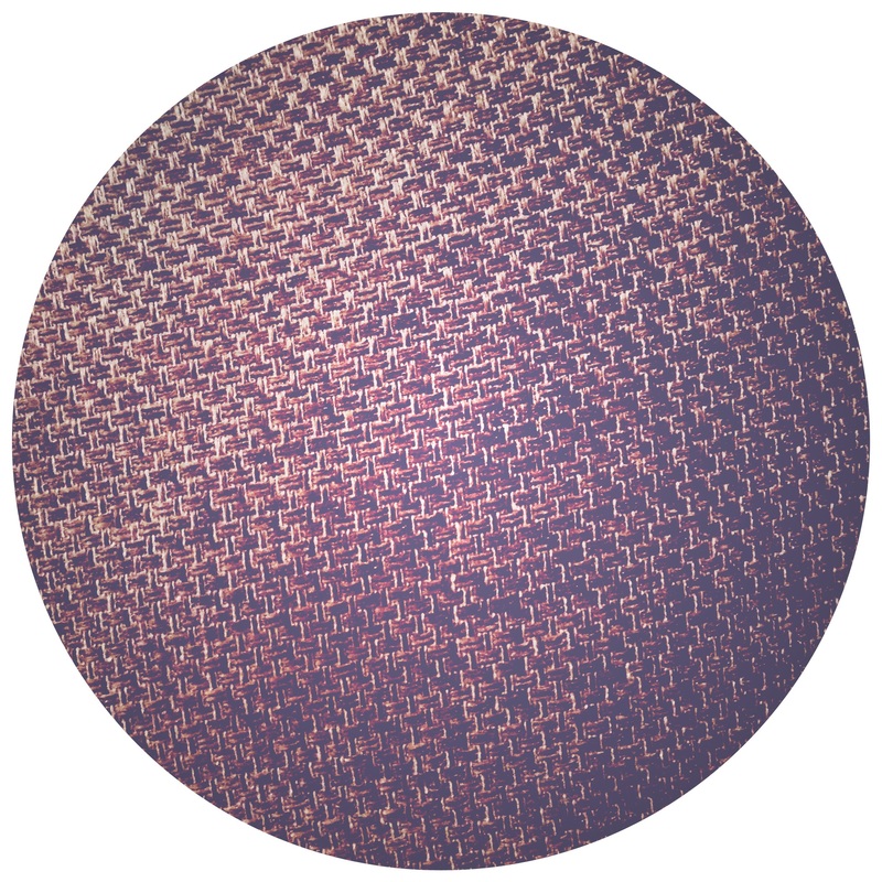
This final image has captured the Rule of Thirds quite successfully. By placing the light blue corrugated corner within the upper right region (intersecting the invisible horizontal and vertical lines) this seemingly simplistic composition has transformed into a dynamic image. There is still an element of ambiguity as to what the surface is (an empty display board within my art room). The use of two tonal values of blue also provides a focus on colour as the subject matter. The subtle difference between the dark smooth blue surface and the corrugated light blue provides a duality.
To develop this image further I could create a series focusing on single colours and their range. Also the use of the Rule of Thirds when cropping my images (either in camera or in post-production) to create more dynamic images.
To develop this image further I could create a series focusing on single colours and their range. Also the use of the Rule of Thirds when cropping my images (either in camera or in post-production) to create more dynamic images.
Because I used the same lens and film effect on Hipstamatic for all the above images some worked better than others. Some images were compositionally boring or dull adding no real aesthetic or meaning behind them. For example, the vertical wooden image. Therefore, in the future I would experiment with a range of effects on Hipstamatic or Photoshop to see which work best for each individual composition. Although the effects did provide a uniformity to the series, understanding which colours, levels of exposure and compositional arrangements work best for each filter would add a greater clarity to my series. I could also divide my series into a Black & White set and Colour set. Potentially creating duplicates, one in each, to see a comparison.
3. Artist/Photographer Research & Response
Research at least 2 of the following artists/photographers (or find 2 of your own relevant artists/photographers).
Create an Artist Research Page for each artist/photographer.
Include name, relevant background information, selection of artworks/images 3-5.
Form your own opinion about their work by analysing each image.
Use the questions in the RESOURCES section of this website to help with your analysis.
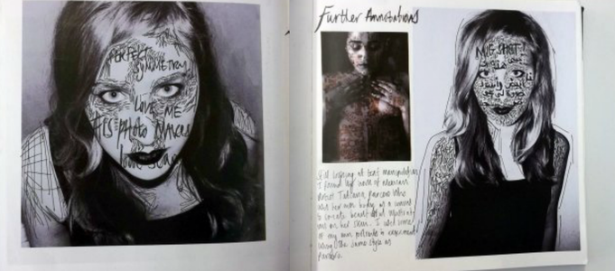
Respond to their work by creating your own photographs. Your responses could be:
In the same style (e.g. Black & White, Portraiture, Photomontage etc.)
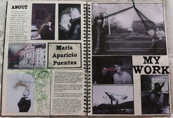
Use the same technique (e.g. Maria Puentese - working over the photographic image using embroidery)
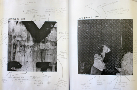
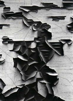
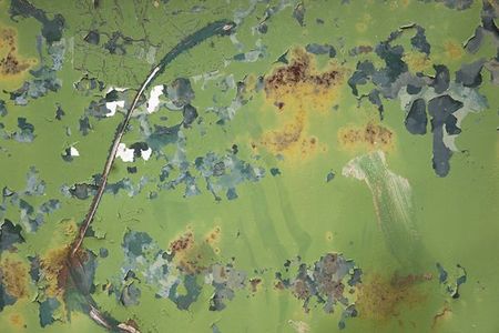
Include similar subject matter/content within the photograph (e.g. Aaron Siskand - peeling walls, cropped and abstract, zoomed in).
Explain HOW you responded to the artist/photographer.
Analyse your responses using the same image analysis support sheets.
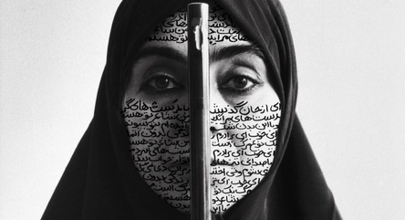
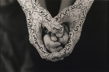
Artist Research & Response Examples:
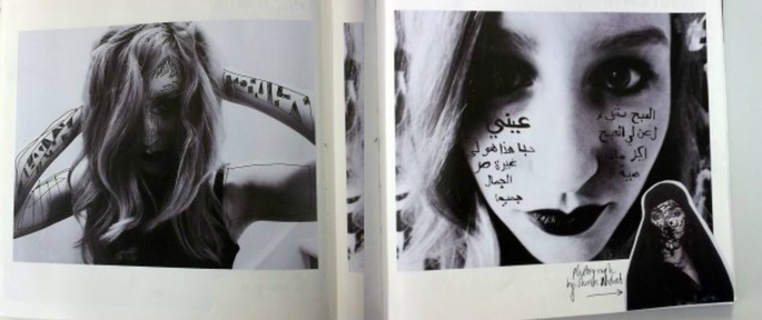
Shirin Neshat Responses
3. Artist/Photographer Research & Response
Research at least 2 of the following artists/photographers (or find 2 of your own relevant artists/photographers).
Create an Artist Research Page for each artist/photographer.
Include name, relevant background information, selection of artworks/images 3-5.
Form your own opinion about their work by analysing each image.
Use the questions in the RESOURCES section of this website to help with your analysis.
Respond to their work by creating your own photographs. Your responses could be:
In the same style (e.g. Black & White, Portraiture, Photomontage etc.)
Use the same technique (e.g. Maria Puentese - working over the photographic image using embroidery)
Include similar subject matter/content within the photograph (e.g. Aaron Siskand - peeling walls, cropped and abstract, zoomed in).
Explain HOW you responded to the artist/photographer.
Analyse your responses using the same image analysis support sheets.
Artist Research & Response Examples:
Shirin Neshat Responses
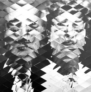
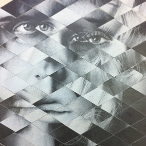
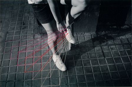
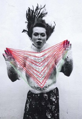
Maria Puentes Research & Response
|
|
Choose at least 2 of the artists/photographers below to RESEARCH & RESPOND to.
Shirin Neshat
Shirin Neshat
|
|
Allison Diaz
|
|
Maria Puentes
|
|
Rut Blees Luxemburg
|
|
Aaron Siskind
|
|
|
|
Task 5 - Create a WEEBLY website
During the summer, unless you have access to a high quality photographic printer or are able to purchase prints of your work it is advisable to create a free website using Weebly.com
Alongside the work you create and document in your black A3 sketchbook it is highly recommended that you present your work digitally through your own photograph/student website.
Use www.weebly.com to set up a free web site.
Use your namephotography.weebly.com for your web address.
For example: tomsmithphotography.weebly.com
